Redesigning a website is always challenging. We get to love and become accustomed to digital products until one fine day, we are asked to re-learn them. The process could be excited with journeys and features more suited to my goals but also frustrating and upsetting.
Now add Tipico, the Sportsbook leading company in Germany with a desktop website that has not seen a redesign in 9 years and receives around 400,000 visitors per month (19 million page views). Those are a lot of potential frustrated customers.
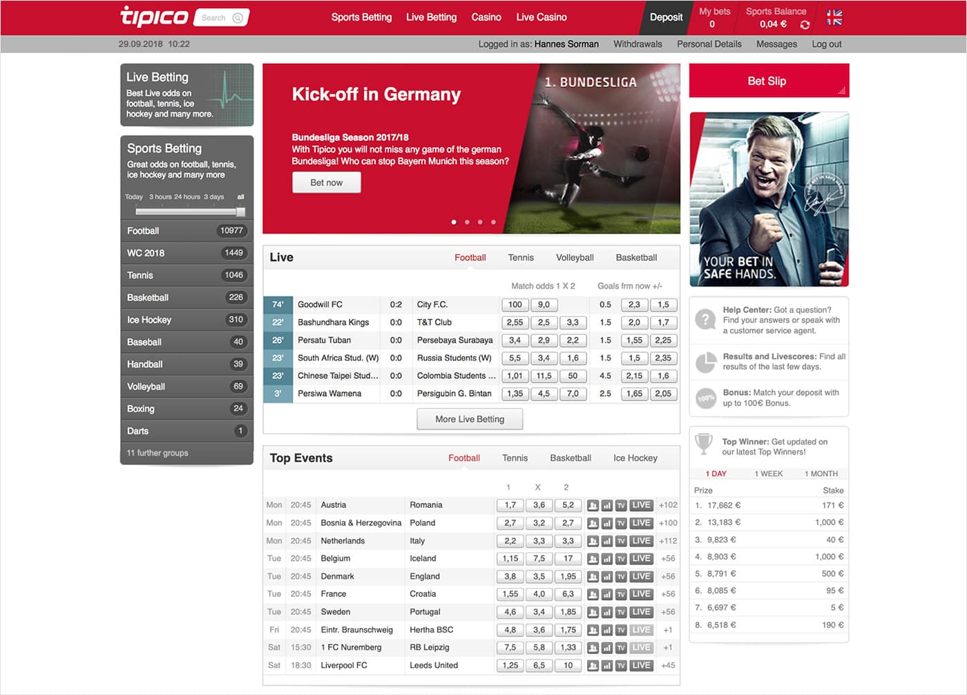 Hello! 2018 non-responsive website 😅
The Challenge
With different platforms and technology for different channels (desktop, mobile and terminals), it was 3 times the effort to implement new features, so Tipico saw the need to unify the experiences and tech background to have faster shipping features, a react framework and microservices to attach to new products when needed.
The goal was to redesign the desktop website with a new technical foundation for a seamless user experience between Tipico’s different channels.
As a UX team, we defined our main challenges:
- Retain conservative users. Focus in user research and testing of the existing products to minimise aversion to change.
- Mitigate the gap between mobile and desktop. Identify success factors in both channels.
- Satisfy the core customer group first.
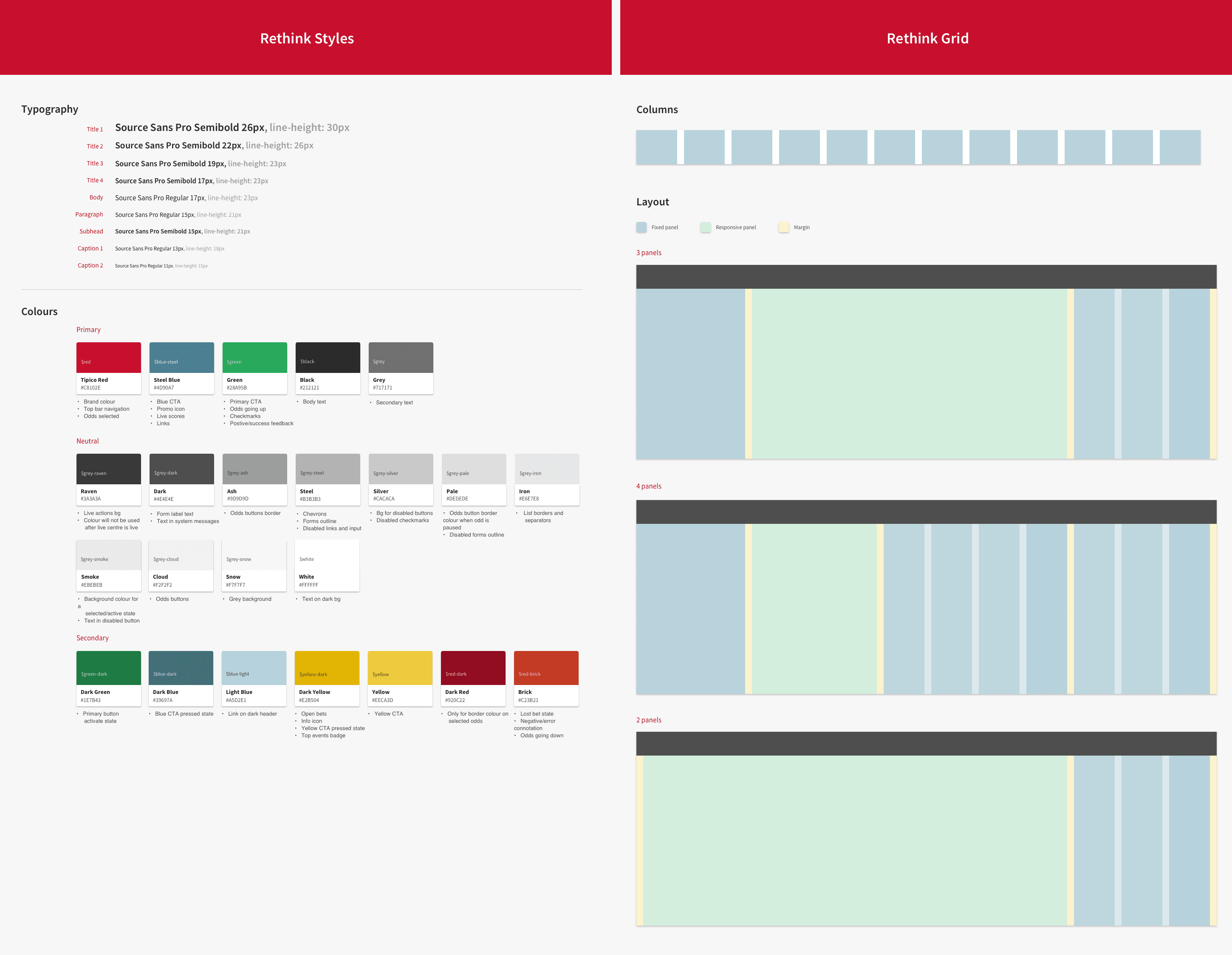
- Create a scalable modular approach.
Initial Explorations & Research
Research prior any concepts was conducted in two main ways:
- Competitive analysis: From market surveys, we identified the 3 top competitors and conducted an usability and feature analysis with outcomes related to homepage, navigation, category pages, event page and betslip.
- Internal analysis: Went through the list of complaints from Customer Service, usability analysis, heatmaps and session videos.
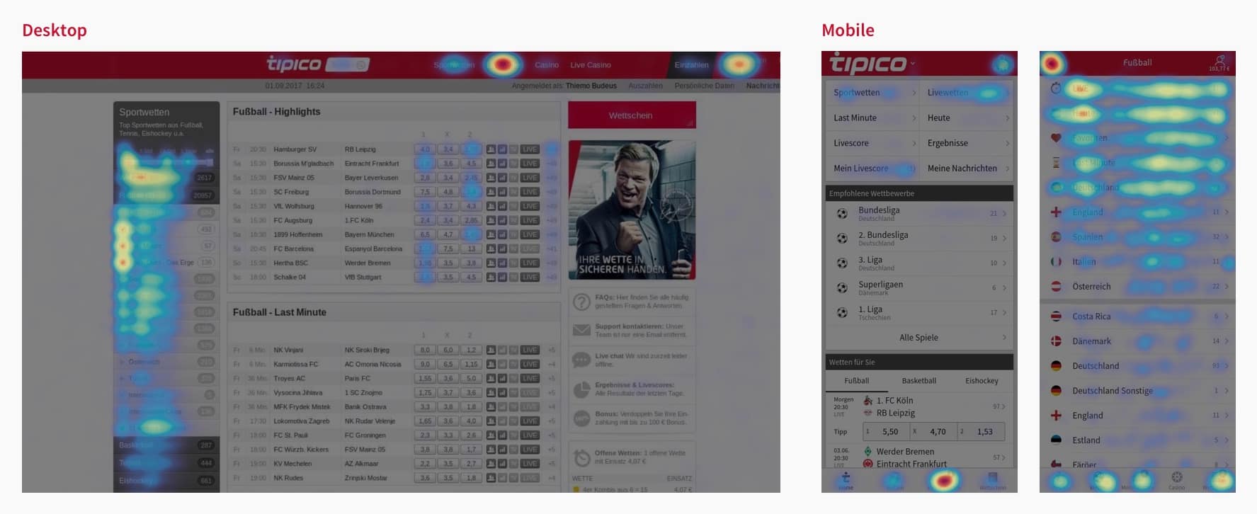
From here we could decide what actions and features were crucial and beneficial, and started wireframes iterations with these conclusions. Even though the project was desktop focused, we iterate with a mobile first approach up to desktop.

Prototyping and & Iterations
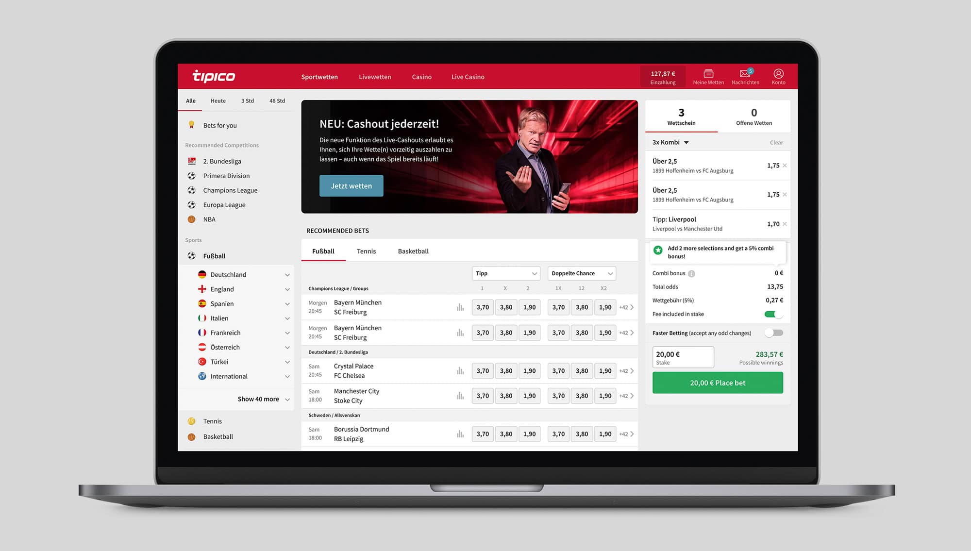
For the UI, I wanted to create a clean and simple style retaining some mobile components and patterns. The main purpose of the first UI iteration was to do quick user testing and once the journeys were improved, polish the visuals.
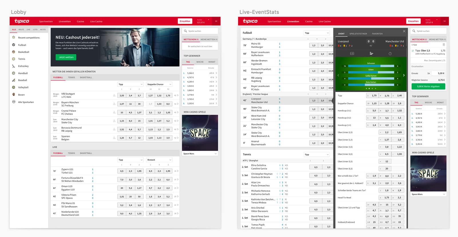 First UI draft for quickly prototyping
We started with basic journeys and created a prototype to test with 5 customers and iterate based on their feedback.
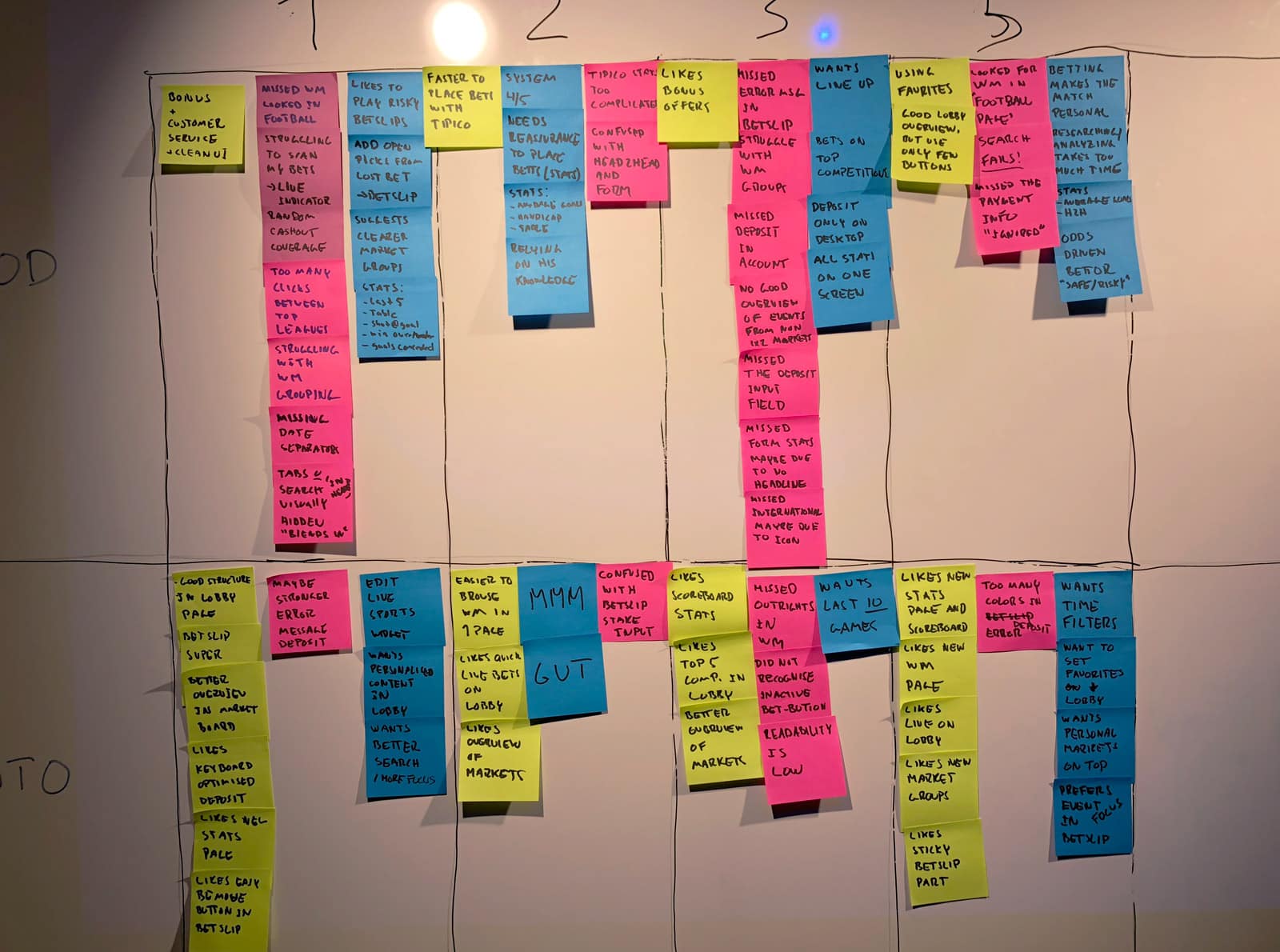
Once rollout of the new desktop website started, we followed up with user sessions on live product and satisfaction surveys to improve upon. Some takeaways were:
- Customers missed a quick way to select all Sports or Countries events from navigation.
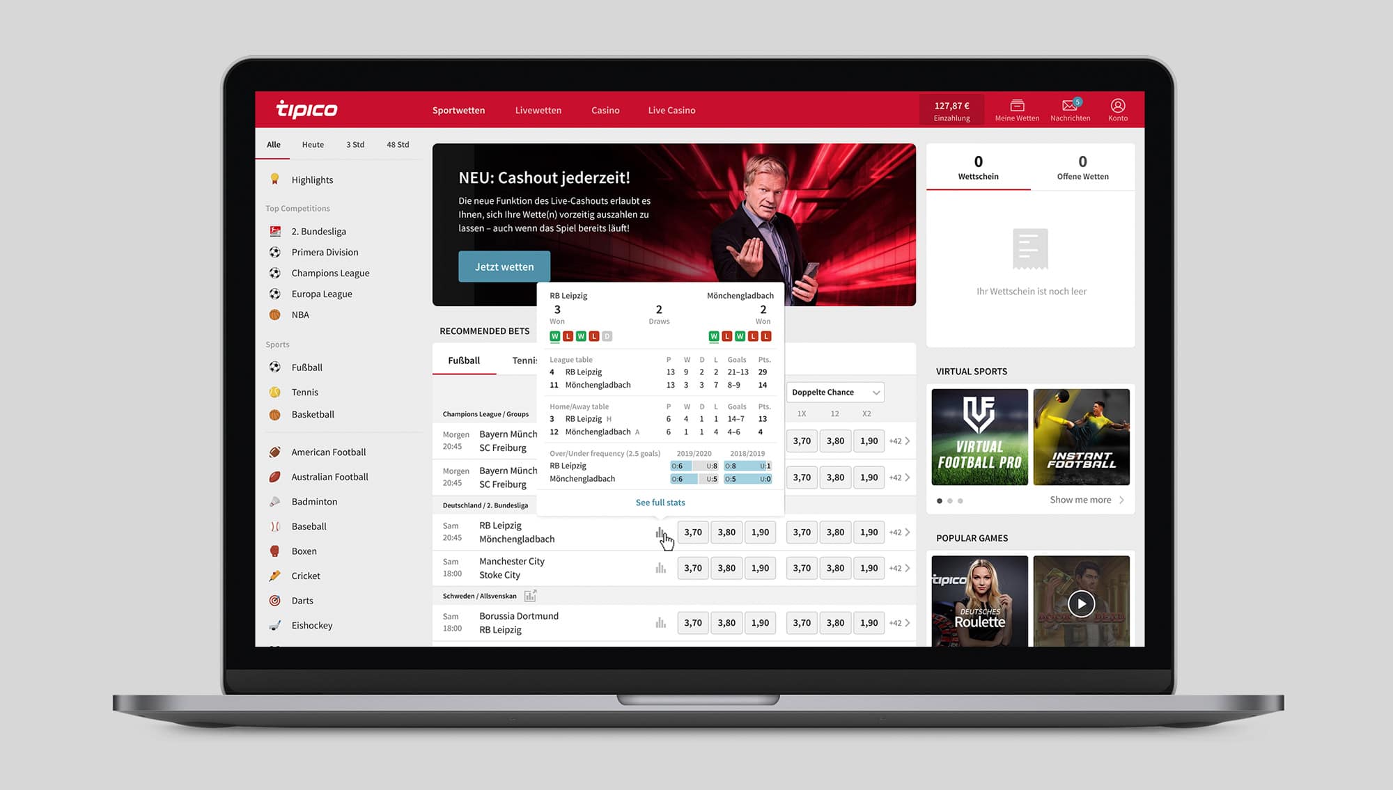
- VIP customers compare stats for each event of their favourite leagues so a quick overview of Stats needed to be improved.
- A more optimised compact version for users with low screen resolutions.
After conducting user interviews and surveys on each rollout phase, the product was launched to 100% of our customers in March 2020! 🤟
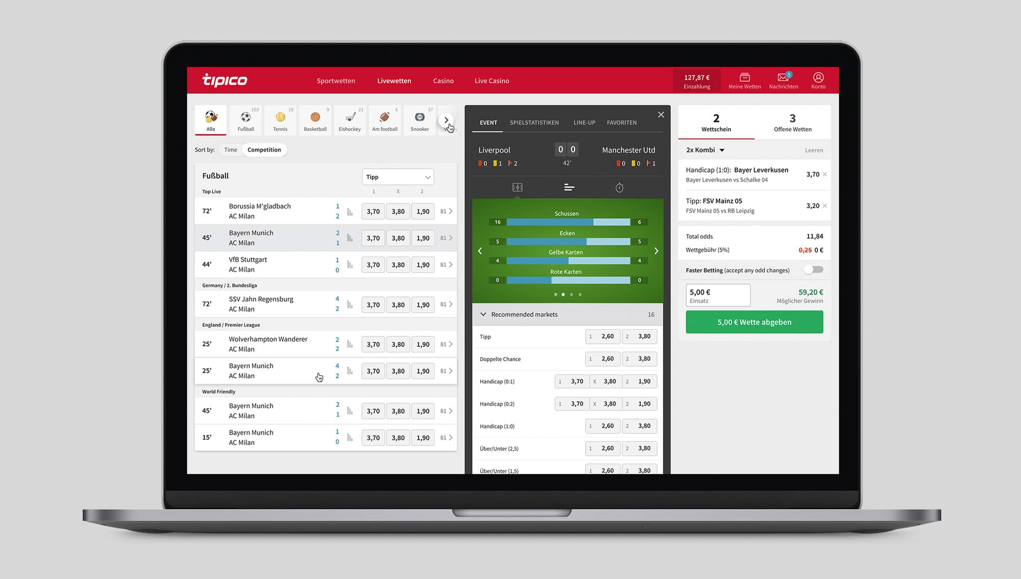
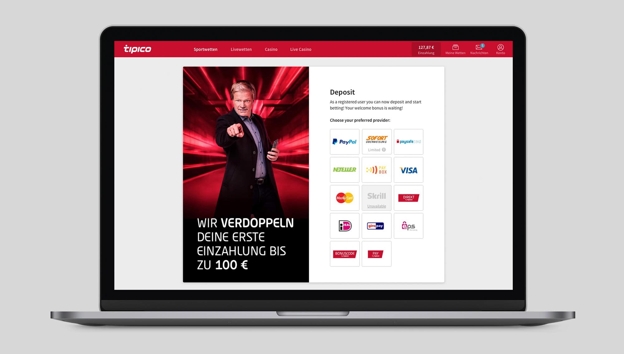
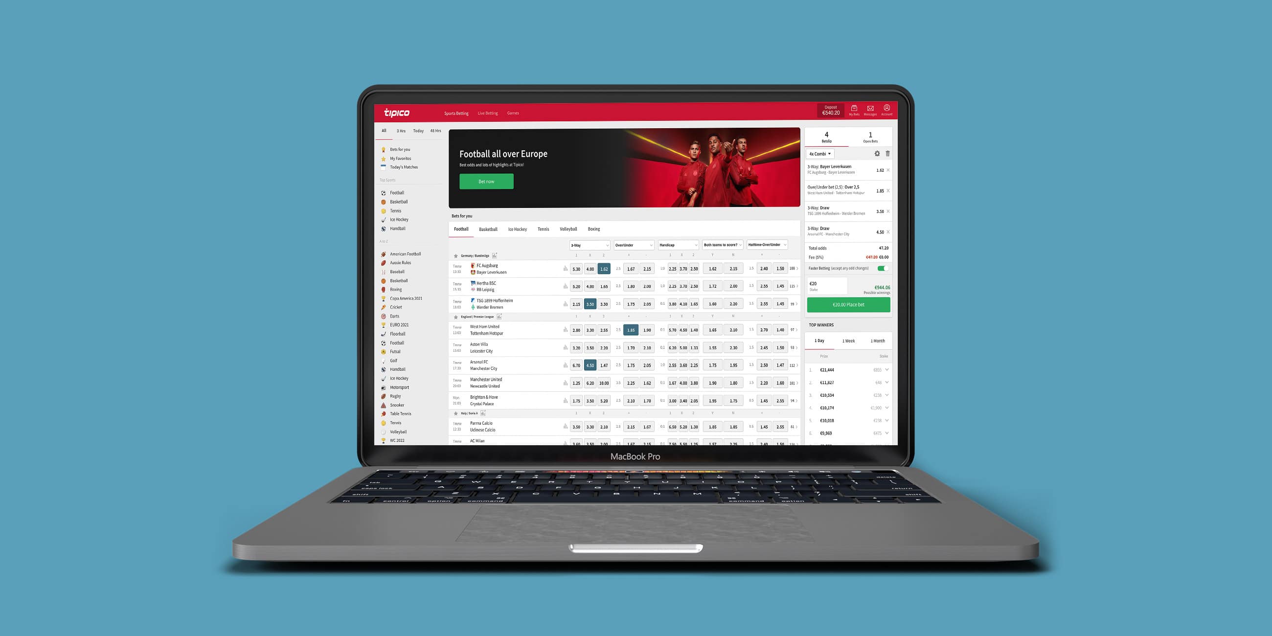
This was our final design.
