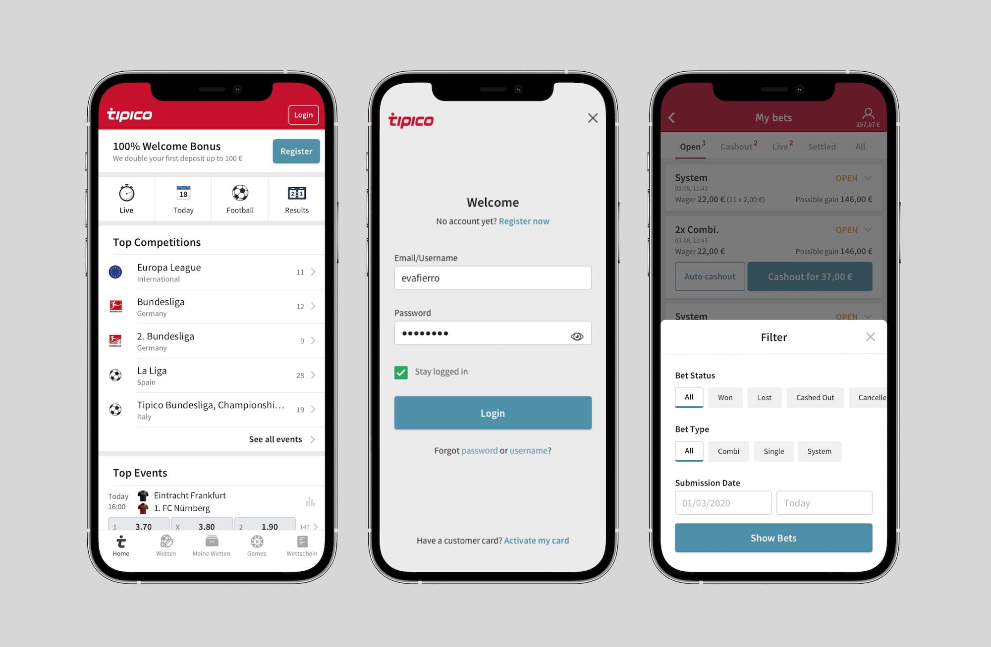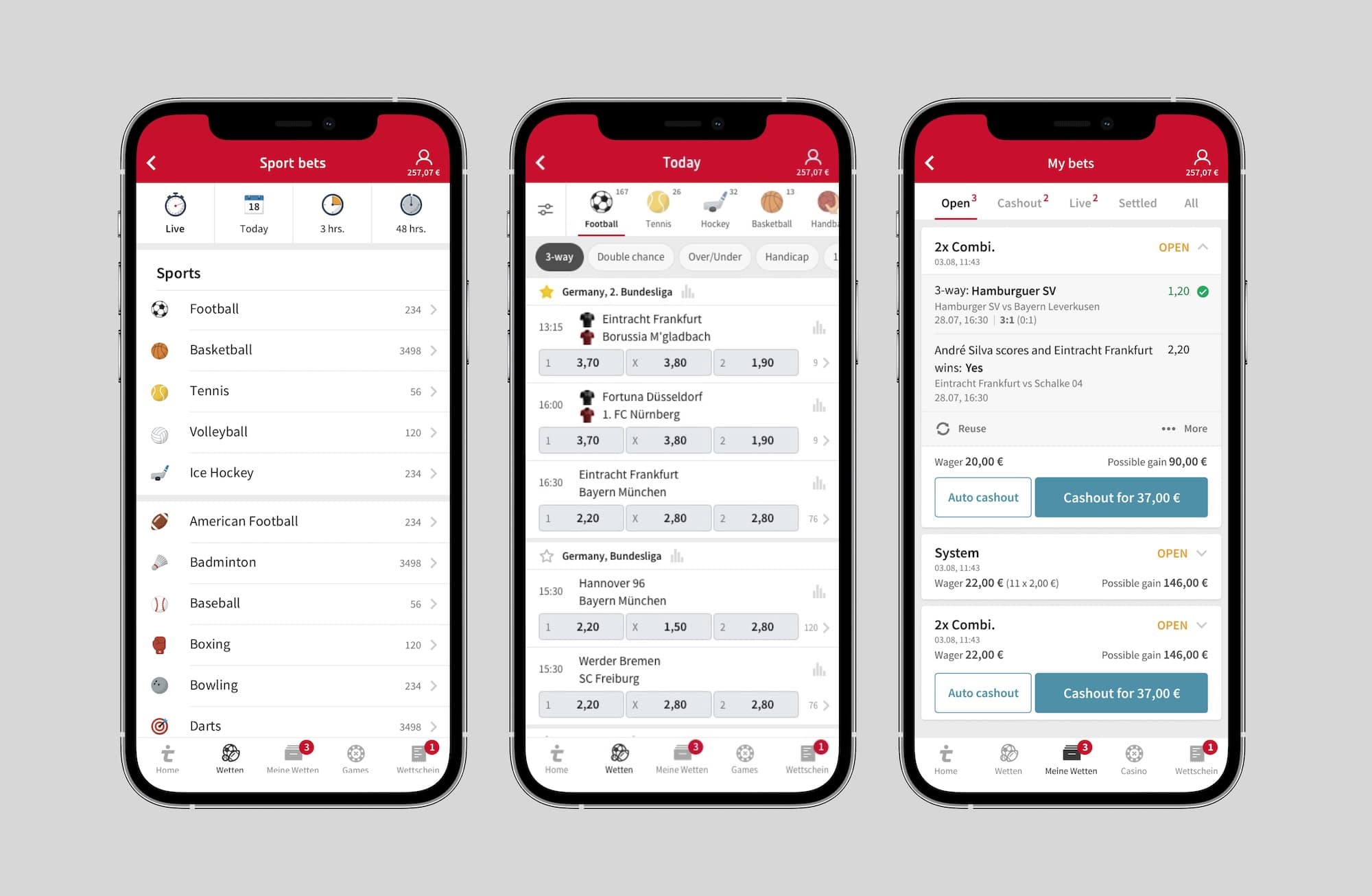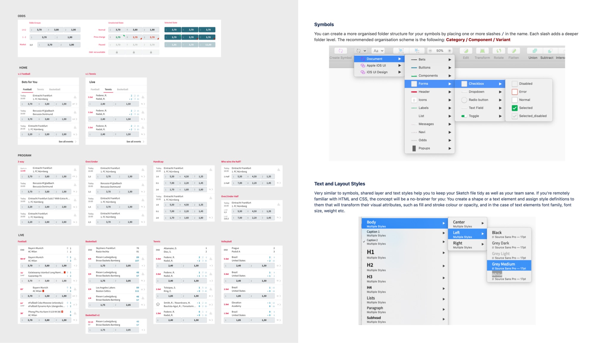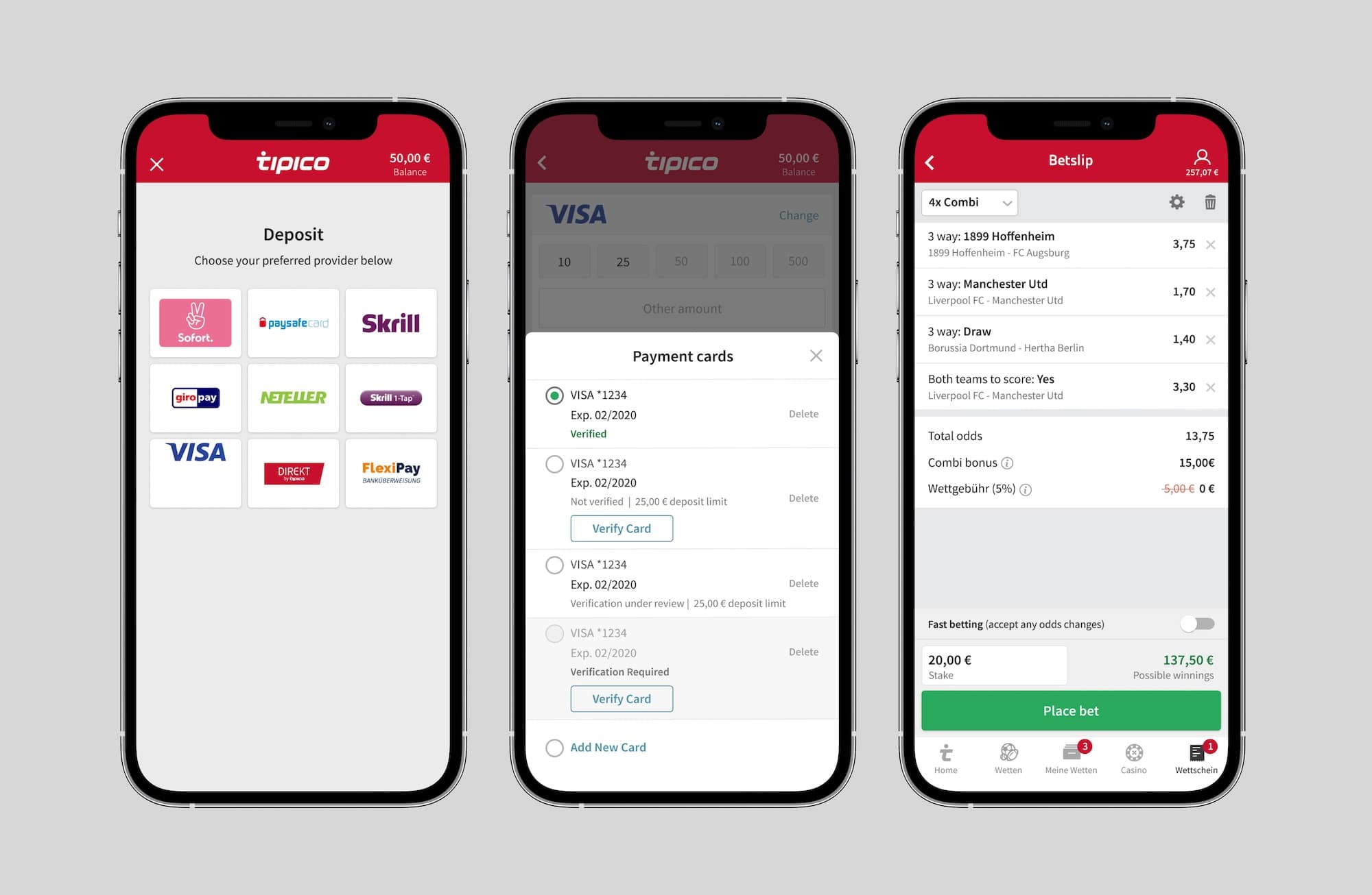
In early 2020, Tipico completed a technical transformation for its desktop website and was ready to tackle the next frontier: mobile. 89% of its users were accessing through mobile and receiving around 2.6 million visitors per month. Even though it didn’t go through major changes for several years, it had a 4.5 score on the App store and 31 NPS.
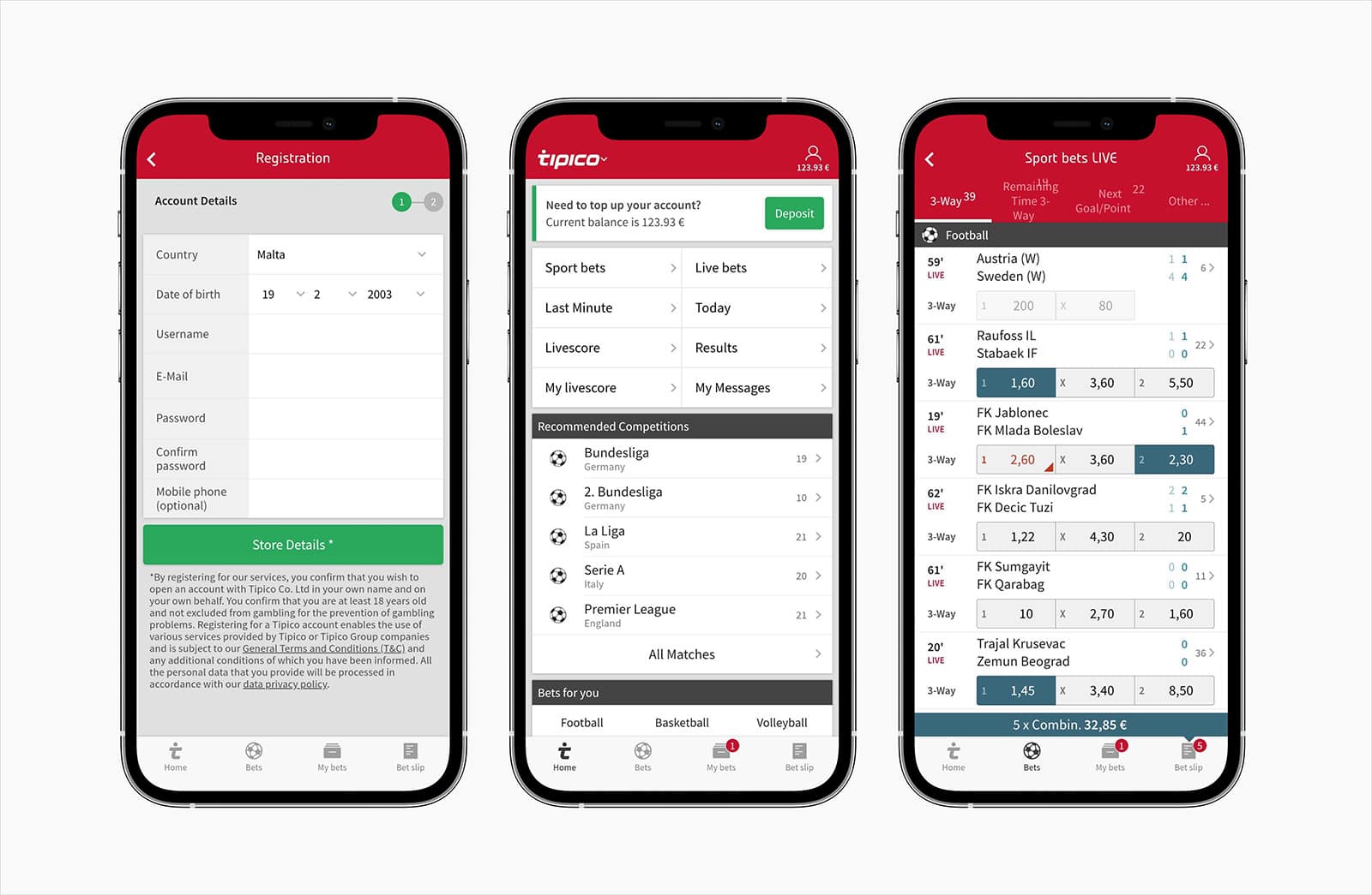 Tipico mobile website in 2020
The Challenge
The goal was to redesign the mobile website with desktop’s technical framework and a new UI to keep core customers engaged and attract young users.
As a UX team, we use the gained knowledge from the desktop website transformation and concluded our main challenges:
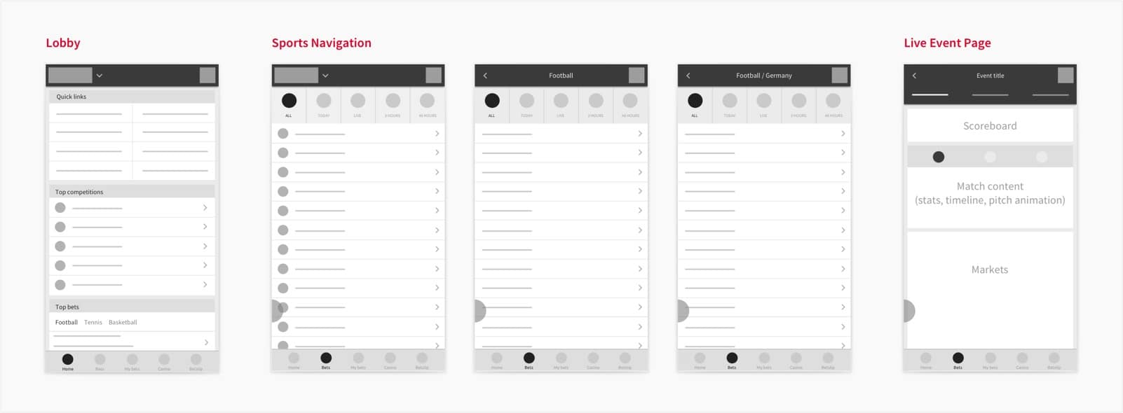
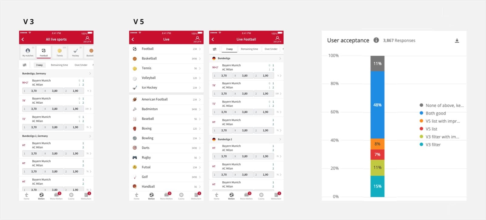
- Make it easier and quicker to find bets. Existing mobile navigation was structured but difficult to explore for non-experienced bettors.
- Seamless integration of microservices. An account and cashier section running independently.
- Strong focus on simplicity. When we asked our customers why they choose Tipico, the top answers are Simplicity and Easy to use.
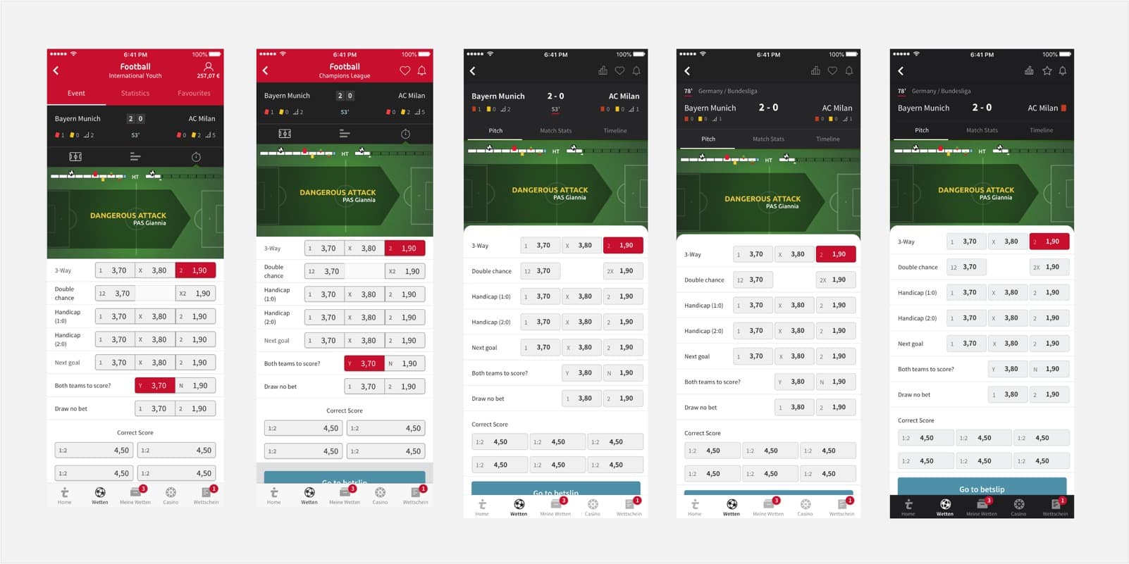
- Update the UI look.
Initial Explorations & Research
Research prior any concepts was conducted in two main ways:
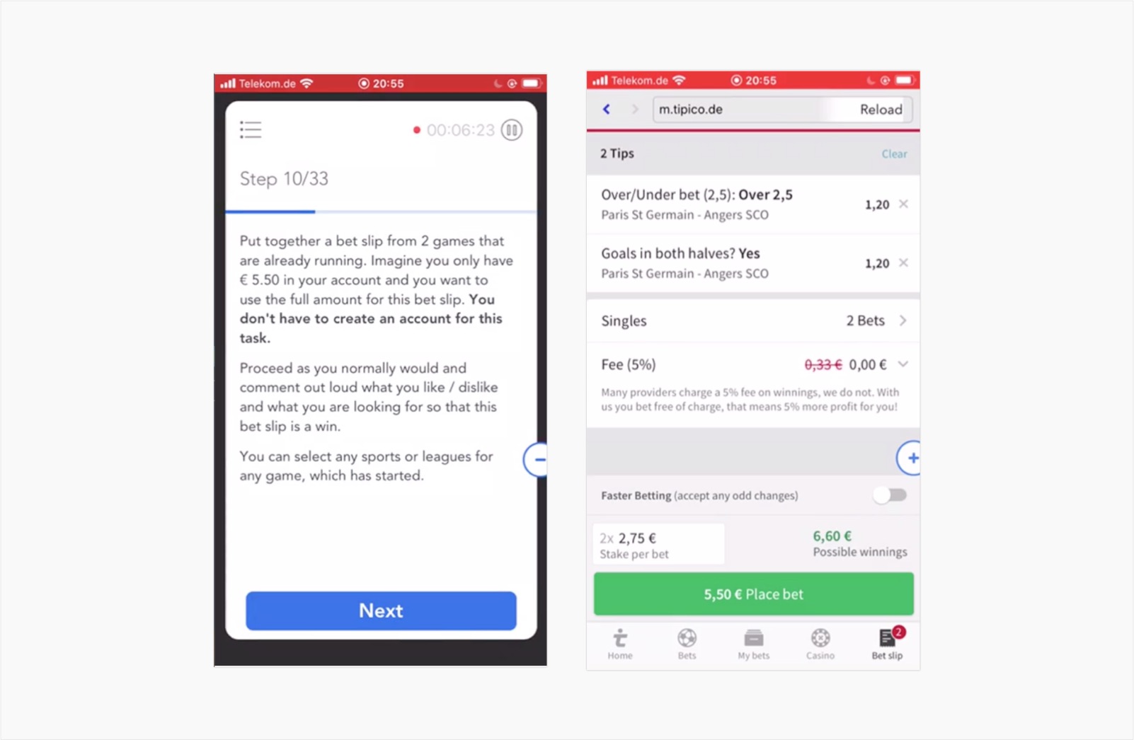
- Competitive analysis: FWe identified the 3 top competitors within Germany, 1 from USA and 1 from UK and conducted an usability and feature analysis. Remote user sessions were set up comparing Tipico and a competitor to get usability insights on the current state of both.
- Internal analysis: Feedback from Customer Service and App store, usability analysis, heatmaps and session videos.
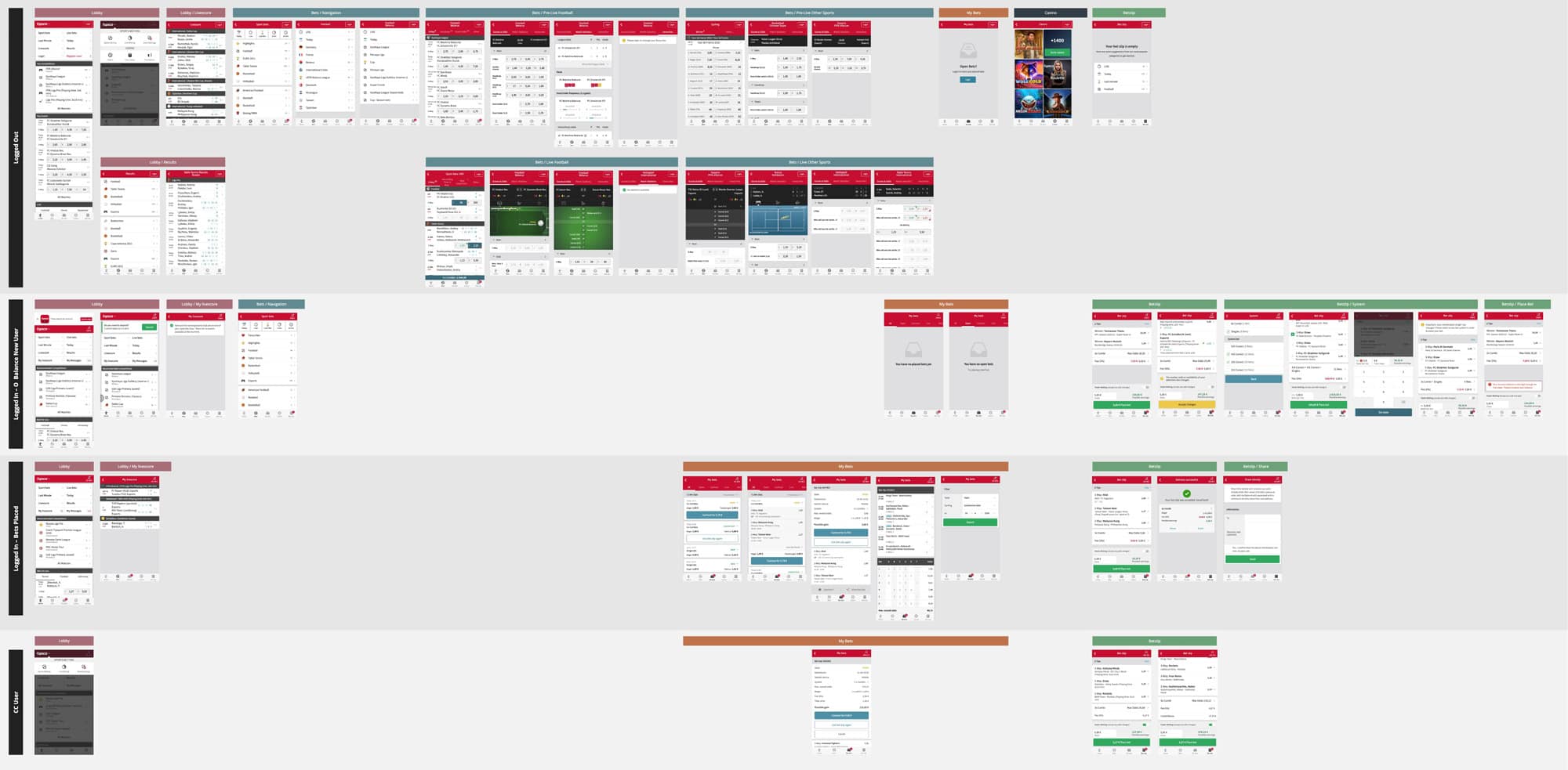
As a design kick off I organised a remote workshop and defined a vision board: emphasis in content and spacing of elements, flat UI 2.0 and one-handed use. We mapped the mobile journeys with our customers’ four states to identify pain points and do quick design exploration for the critical ones.
